Today Icelab Learned
 about css

background-position precision with the calc property

Positioning a background-image with CSS can be a frustrating experience. In fixed layout contexts you can use pixel or percentage values for precision positioning, but when you‘re working with a fluid layout, this can be a real headache.

Let‘s start by reviewing the background-position property:

.element {
  background-position: xpos ypos;
}

In most cases, this will be a fixed unit (20px 30px), a percentage (50% 100%), some keywords (left top) or a combination thereof (right 20%).

So what can you do if you want to position an image 40px from the right edge of your fluid-width container? Our favourite calc property to the rescue!

.element {
  /* Position the background at the right edge, then offset it by `40px` */
  background-position: calc(100% - 40px) top;
}
Using the flexbox order property to rearrange elements

Flexbox introduces a whole bunch of neat layout tricks that we can start using today. Things that we once needed JavaScript (or duplicate markup) to achieve are now doable with plain old CSS.

One such property that I’ve found myself using repeatedly is order. We can assign a numeric value to a set of elements and the browser will reorder those elements on the screen — without manipulating the DOM.

Adjust the order property in the following example to see the technique in effect:

The flexbox order property mAVYGy

So where is this useful? There’s a bunch of scenarios you might like to utilise this property: one example is bringing a navigation <aside> to the top of the screen on a mobile optimised layout.

If you resize your browser to a phone-width and inspect the source of icelab.com.au, you’ll see that the navigation bar in the footer exists below the contact detail elements in the DOM. But thanks to our friend order, we can completely rearrange the layout for this context. Neat!

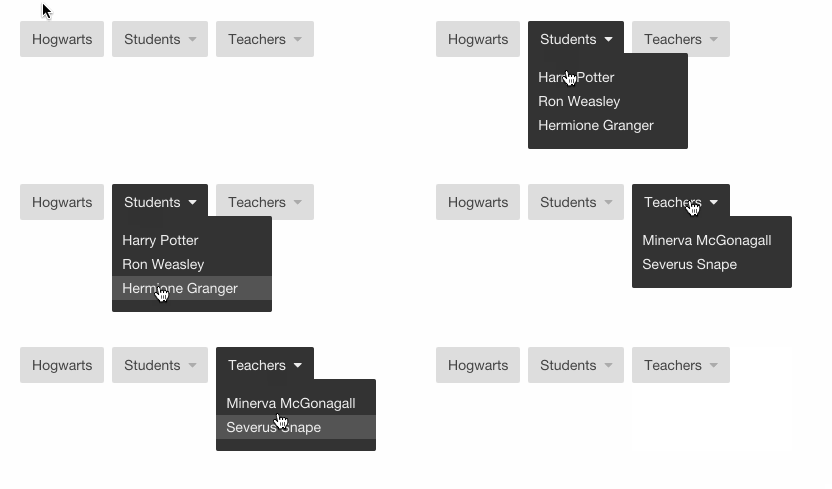
CSS dropdown menus

Creating a CSS-only dropdown menu is easy!

CSS dropdown menus are the bomb

Using nested lists, the basic structure is:

ul.nav
  li.nav__list-item
    a.nav__list-anchor href="#"
      | Hogwarts
  li.nav__list-item.nav__list-item--has-dropdown
    span.nav__list-toggle
      | Students
      i.fa.fa-caret-down
    ul.nav__dropdown
      li.nav__dropdown-list-item
        a.nav__dropdown-list-anchor href="#"
          | Harry Potter
      li.nav__dropdown-list-item
        a.nav__dropdown-list-anchor href="#"
          | Ron Weasley
      li.nav__dropdown-list-item
        a.nav__dropdown-list-anchor href="#"
          | Hermione Granger
  li.nav__list-item.nav__list-item--has-dropdown
    span.nav__list-toggle
      | Teachers
      i.fa.fa-caret-down
    ul.nav__dropdown
      li.nav__dropdown-list-item
        a.nav__dropdown-list-anchor href="#"
          | Minerva McGonagall
      li.nav__dropdown-list-item
        a.nav__dropdown-list-anchor href="#"
          | Severus Snape

And the bare-bones CSS:

.nav__list-item {
  display: inline-block;
  position: relative;
}

  .nav__list-anchor,
  .nav__list-toggle {
    cursor: pointer;
    display: block;
  }

    .nav__dropdown {
      display: none;
      position: absolute;
      z-index: 2;
    }
    .nav__list-item--has-dropdown:hover .nav__dropdown,
    .nav__list-item--has-dropdown:focus .nav__dropdown {
      display: block;
    }

      .nav__dropdown-list-anchor {
        display: block;
      }

Consider mobile

:hover triggered menus don’t feel great on mobile. A nice solution is to use a JavaScript click event to append a modifier class to the the toggle element (.nav__list-anchor--dropdown-is-visible) and use that class to perma-show the menu.